|
For this project, I worked in Adobe Illustrator. This project was time consuming. I had to outline all the shapes and features provided in the image of my dog. Then, I had to change the color to gradient to match with the image.
0 Comments
I selected these two photos that I took to use for this project. The first one is of the light house in York, Maine and the second one is from Tangerinis. To do this project, I followed off a tutorial off of itslearning.
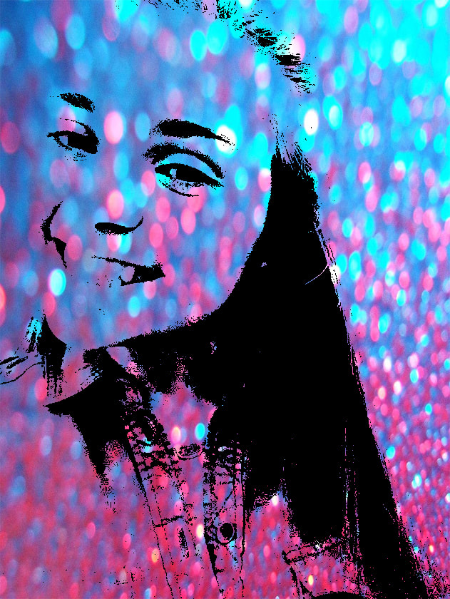 For this project, I selected an image of myself and placed a filter on it. This made it to fade out and then I placed an image off of the web to be the background.
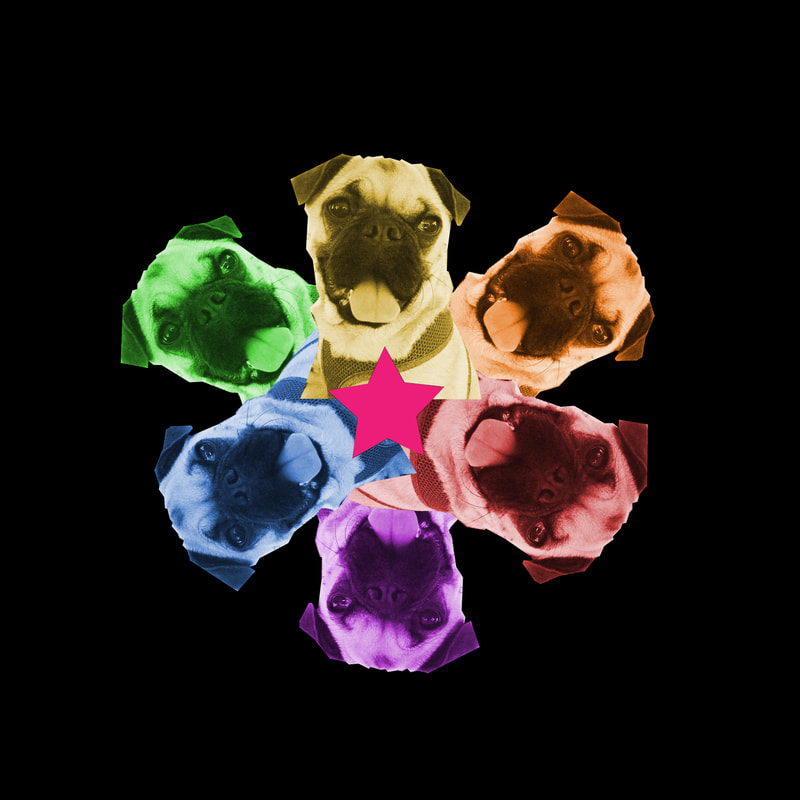 For this project, I created a star and placed it in the center. I then photo-shopped a photo of a pug surrounding the star. Afterwards, I changed the colors of the pugs as it is on the color wheel and changed the background to black.
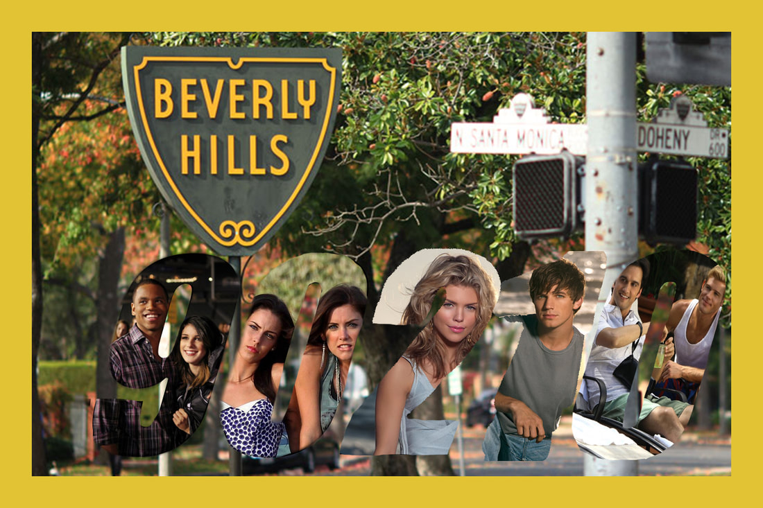 This project was really fun but difficult. I selected the tv show 90210 as my postcard theme. I had a background of the Hollywood sign as my background and a yellow border surrounding it. For the numbers in the title of the tv show, I placed the characters in them. I used Adobe Photoshop for this entire project. I was having trouble with having solid outline of numbers than looking like it was fading.
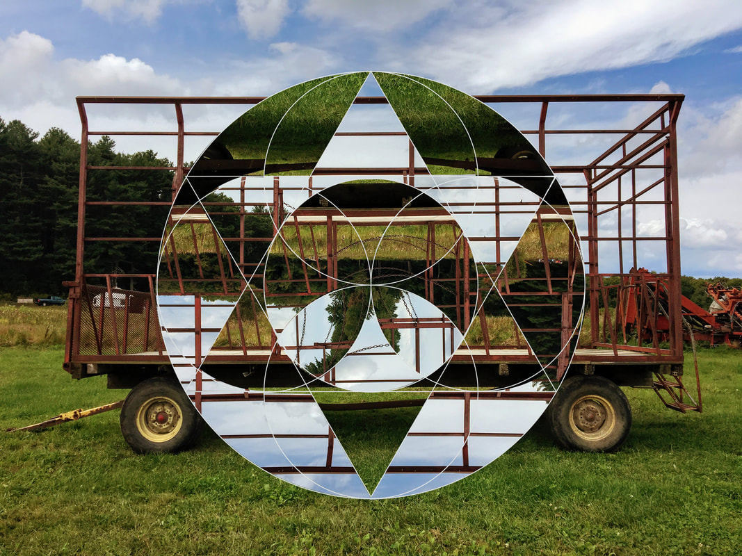 For this project, I used an image of a hayride that I took in the fall at Tangerinis. To create this geometric collage, I used the template that we were given so that it was easier to do. I copied and paste the template onto my image. To move some of the shapes around, I had to select the area with the magic wand on the template layer but then copy and paste on the background layer. I continued to do this in my collage. Some of the shapes, I had to rotate them but then make the pieces fit into the template by either making it bigger or smaller. This is my final outcome.
The photographer that I chose to research was Annie Leibovitz. She was very inspiring and interesting to research about.
The process of how I selected and found my letters was that I went looking through the hallways of Millis High School and tried to think creative. Some of my letters were found off of the Internet. For the letters of my name, I created it through google slides. I placed the photos onto the slide and I arrange them in order. I used this way before realizing that I needed to use Adobe Illustrator. I did the same thing what I did in google slides for the whole alphabet but I arranged the photos in different shapes and angles.
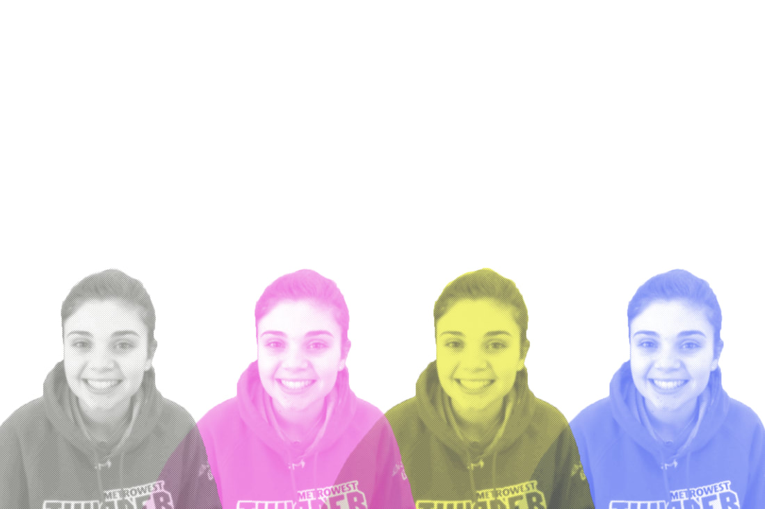 CMYK is a color model used for color printing. CMYK stands for the colors cyan, magenta, yellow, and key (black).
The photo that I have chosen was of me from prom. To select my color scheme, I had to use the gradient tool in photo shop. I selected the colors pink, purple, and a turquoise color as my gradient. Once tracing the image and beginning to paint our photos, we had to label it as a paint by number. Following the steps of labeling, I began to paint. While I was painting, I went off script a little bit with my colors. Instead of a more purple, pink, and turquoise gradient that I chose in the beginning, I changed it up. I chose different color shades of the pink because I couldn't get the exact color as my template. Also, the same exact thing happened when mixing the paint for the turquoise. Even though I had to go off script from the template version, I am still happy of how my painting came out at the end.
|
